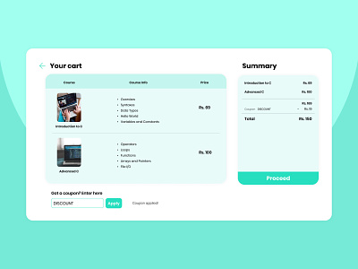
Online Courses Checkout Page Concept
Recently my friend asked me to design a checkout page for a website he was working on. The website was about online courses about programming. Rounded edges, green colour palette and Poppins typeface was kinda the theme of the website so referring that, I made this checkout page.
Hope you like it. Feedback appreciated.
Check out my Behance
More by Rahul Terwankar View profile
Like
