Mobile Home
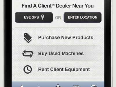
Part of the homepage for a client's mobile site - would love your feedback. Does anything feel "off"? Do you think the icons work at their current size?
NOTE: "Buy Used Machines" is showing it's "touch" state. Also all text has to be native as this site will need to be internationalized which limits font / image choice.
Thanks in advance.
More by Jason Vanlue View profile
Like
