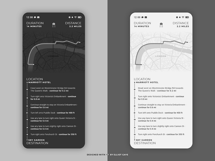
DailyUI #020 - Location Tracker
Bonjour Dribbblers 👋
This is my #020 #DailyUI design.
Design Hint 💻 - Design a location tracker. Consider the icon, placement, and purpose of location.
The Idea 💡 - The idea for today’s UI design is a simplistic destination tracker, with directional steps being the forefront of the design. The design will encompass a map of the location and destination, it will also have a step by step list of directions to allow more ease of use when travelling, these will be both accompanied by real-time duration and distance notifiers. The colour palette will be monochromatic with the app having the option of either a "dark mode" or "light mode", again for the end user's ease of use at anytime of the day, in any lighting situation. The typography will give the app a modern look, using straight-lined thin and thick fonts.
Final Thoughts 🧠 - I love the way everything seems to just fit correctly, like the elements were destined to be placed in the position they are; it just looks right. I put an emphasis on the location of elements for this UI, and I certainly think its paid off. The fading of the map was inspired by other designs on Dribbble. The "directional steps" part of the UI was the main focus due to that "ease of use when traveling" requirement I set myself, and the way I went around designing that section of UI certainly looks, and feels unique to me. The fact that my proof of concept was intended for light adaptation using "dark" and "light" modes just gives the overall design plus one point. Overall, I really do like my destination tracker I designed today and I think it would work in a real life scenario.
Hope you enjoy my work ❤️ - press "L" to leave a like!
As always, I welcome any feedback! 😄
Lastly, share the love by pressing the share button if you really like what you see! 👍
- Elliot
