Brutmaps Website Design
Hey, friends! How is it going?
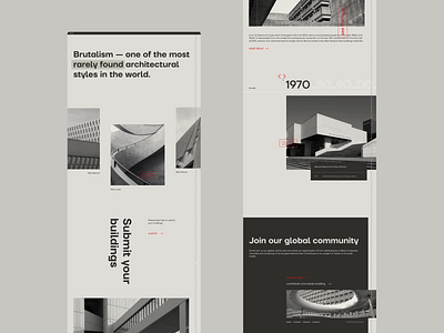
This is a website design for Brutmaps.com The idea of the project is to show brutalist buildings from all over the world. We've decided to show some historical buildings to educate people and to encourage them to submit buildings. The visual keys are monochrome concrete colors with accents in red, heavy typeface and clean layout. Have a look at sideline text that is going down as you scroll. You can find slider animation and the actual building page animation in previous shots.
How do you like it? Leave a comment and don't forget it to like it!
More by Daria Lomova View profile
Like


