Daily UI - 02: Credit Card Checkout
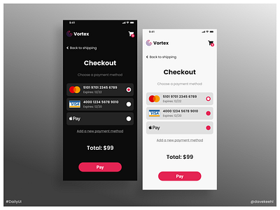
In this second #DailyUI challenge I wanted to practice mobile design once again, but also keep thing simple. I knew I wanted both a dark and light mode, so I tackled the colors first, trying to find a nice accent to be reused throughout the design process. Afterwards, I started to build a rough layout with all the elements I thought would suit a checkout page.
At that point, I struggled a bit to decide which elements to keep, since the screen is so small. Eventually I realized that a smart move could be to just have a list of payment methods. That way I didn't have to make another form to write all the credit card details. After that was settled, it was pretty easy and I didn't have any issues completing the design.
For the presentation, I wanted to have something a bit corporate/classy, since it's a pretty "serious" design. I struggled a bit with the background, because the accent color is very similar to the background color of the previous #DailyUI challenge, and I didn't want to repeat myself. However, after some trials, I noticed that a grey-to-white gradient could work... and in fact I think it really does! The white border is just a nice I wanted to add at the end.