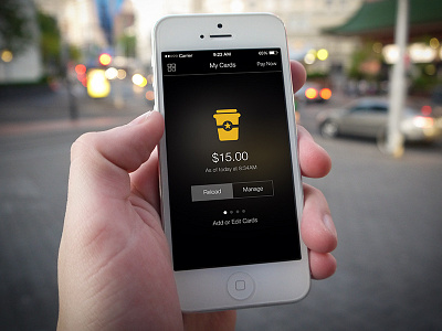
Starbucks for iOS 7 Concept
I use the Starbucks app on a daily basis most of the time. One thing that has always bugged me is the UI and UX on the card detail screen. So when iOS 7 came out, I expected an update... But alas, that didn't happen.
So here is my concept of what I wish it looked like.
Real pixels attached.
More by Brandon Jacoby View profile
Like

