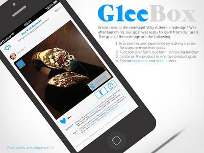
Gleebox Redesign
Dribbble shot hipster-tilt level: hipster.
Check out the real pixels of the redesign, which are attached! I redesigned the entire GleeBox app because after we launched, I learned a lot about how our users were using GleeBox. Our primary goal was to learn from our users based on both qualitative and quantitative data (user studies and metrics - for metrics we use a 3rd party product as well as our own dashboard). I use design to reinforce user goals which in turn, reinforce product goals - decisions are made to benefit the user and we iterated based on our learnings. The goals of the redesign are as follows:
1. Improve the user experience by making it easier for users to meet their goals.
2. Focus on function over form, but use form to reinforce the function since form is an important part of function
3. Iterate on the product to improve product goals
4. Spread happiness and delight users!

