Component documentation


Since we’re using Storybook with MDX to document our design system, we’ve built some components to help standardize documentation, and easily keep information formatted and up to date.
Header
We wanted to make it easy to get context for a particular component, and standardize the format of our documentation pages. The header component takes the thinking out of what standard metadata to provide for a component, with quick links to valuable context.
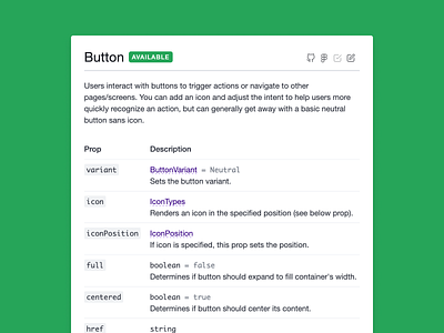
PropsTable
We found that Storybook knobs alone—as great as they are—weren’t enough to communicate relevant metadata about a component’s props. It wasn’t immediately clear what was required, what the exact name of the prop was, and what default values were. Additionally, without a standard, different developers implemented prop tables differently, resulting in a fragmented experience.
Our improved prop table makes it easy for developers to document information about a component’s props, in addition to code samples and knobs.
~
If you’d like to help contribute to our design system, we’re actively hiring both product designers and engineers. Learn more about what we do, or shoot me a message (on Twitter or via email) if you want to chat!