Windows 2005
Hi,
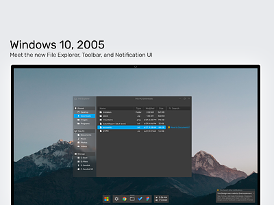
This is my first post to Dribbble. I wanted to design what my ideal File Explorer application would look like, and just some changes I've wanted to see in Windows for a while, like a center taskbar.
In my design, I detached the Windows key and replaced it with the Microsoft logo to give it some color. I set it aside so that it could really feature the brand. The File Explorer gets a large visual overhaul. I removed the massive path bar which took up far too much space and condensed it into text at the top of the window. In a real world scenario, you could click the text and move through the directories. I also wanted to add a feature of my own. Some kind of AI would be nice in File Explorer to suggest moving certain file types to certain places. For example, in my shot, accounts.txt was suggested to be moved to Documents. In terms of other visual aspects, I added some clarity, which Windows itself tries to add in certain places but is never really consistent. I continued that transparency to the upper portion of the notification, which tells you how many additional notifications you have. For the blues and yellows in the UI, I simply took from MIcrosoft's own logo colors to work with the brand.
Of course, this is unofficial, but maybe someday it can be a reality.
If you have any feedback, I would greatly appreciate it! I'm excited for my long journey into design with Dribbble.