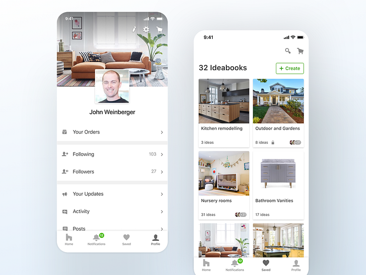
Houzz - mobile apps navigation redesign
As a part of my role at the Houzz product design team, I redesigned the iOS and Android native apps' main navigation. The goal was to differentiate between the user's tools, such as Ideabooks, Notifications, Messages, and Profile, vs. the main content verticals (Photos, Shop, Professionals, Stories). We wanted to make the user's tools more prominent and expose them from the profile screen.
One of the main changes in the new navigation is the Ideabooks screen, which is now a standalone tab. In the original UI, the ideabooks were inside the profile page ("Your Houzz"), and users couldn't find them easily. Splitting between the ideabooks and profile improved the user experience for both screens. In addition to surfacing Ideabooks and making them more accessible, this redesign enabled us to surface actions in the profile screen, such as Your Orders, Settings, Your Updates, etc.
Check it out in the stores!
