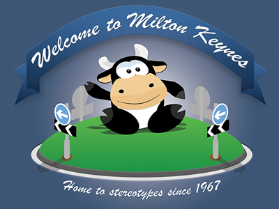
Poster for Milton Keynes Design Forum
This is me poking fun at the general lack of imagination put into the marketing of Milton Keynes. Have made intentional bad choices of typeface, depth of field, lighting, shading and proportion. Annoyingly, despite all that stuff I still like the image.
More by Anthony Faconti View profile
Like
