Best vs. worst locations — which icon?
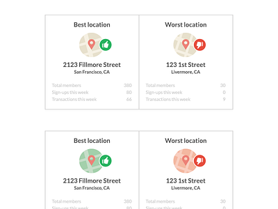

I'm leaning toward the more subtle one (top) since the difference is pretty evident just based on the colors of the thumbs-up icons.
What do you think?
I'm leaning toward the more subtle one (top) since the difference is pretty evident just based on the colors of the thumbs-up icons.
What do you think?