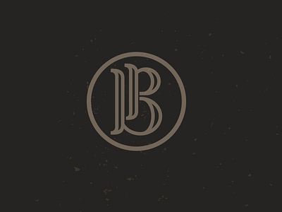
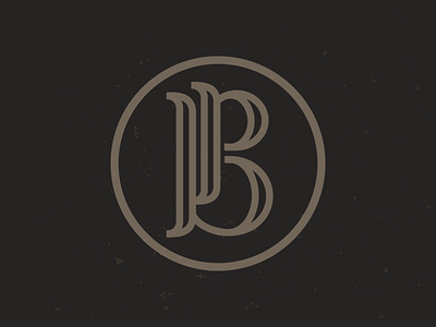
PB 1alt
Client is leaning toward this design approach.
I moved the "p" over and changed up the "b" ever so slightly, but does it help separate the two letters a little better?
And still hold the capital "B"
Thanks.
More by Mike Bruner View profile
Like

