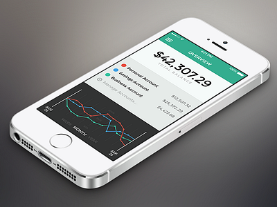
Banking App – Overview
The iPhone app of my German bank isn't exactly eye-candy, and on top of iOS 7's flat interface it now feels even more misplaced. This made me think about what I would imagine an ideal banking app to look like, and decided to give it a spin for the sake of some general iOS 7 exercise.
I started with a little bit of research on existing mobile banking solutions and found that most apps seem to be lacking a straightforward way to get an overview of your funds. Instead, you're mostly thrown right into the transaction history or other features you don't need when all you want is a quick glance at how your accounts are doing.
So my first goal was to get that straightforwardness in there; this overview screen is the result. It provides an at-a-glance view of your total and individual accounts' balances without any unnecessary features being in the way. Also, it visualizes how your accounts have fluctuated within a recent period of time (week, month or year).
Be sure to check out the attached real pixels!
