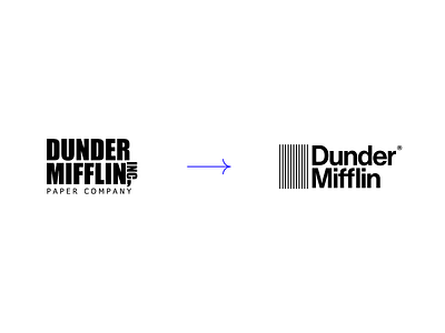
Logo Comparison
The Office is a pseudo-documentary television series famously known and awarded worldwide, featuring a fictional paper distributor, Dunder Mifflin. The series completed 15 years, in March 2020 and as a tribute, I realized that it would be a good idea to redesign the most beloved paper company in the world.
Dunder Mifllin Inc. is a fictional regional distributor of paper and mid-sized office supplies with an emphasis on serving small business customers. With a corporate office in New York City, Dunder Mifflin has branches in Albany, Utica, Scranton, Akron, Nashua, Buffalo and Rochester. Seeking to expand its services worldwide, it was necessary to create a new brand, a new identity for the company, to attract potential interested customers.
The concept of the new brand is to maintain the same corporate essence and relatively serious of the company, creating an identity with a more modern, simplified, clear and objective aspect. The variations in shades of blue, refer to the idea of integrity, trust, sincerity, quality and safety in their products sold.
