DailyUI #018 - Analytics Chart
Ciao Dribbblers 👋
This is my #018 #DailyUI design.
Design Hint 💻 - Design an analytics chart. Is it to be used for web or app analytics, a health monitor, e-commerce analytics? Consider filters, chart types, and the core features/statistics the user would need most.
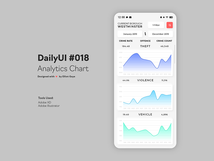
The Idea 💡 - The idea for today’s UI design is a theoretical real-time analytic mobile app for crime statistics from the Met Police based in the city of London, for Android and iOS. The app will feature various "filter" settings and a dedicated "time frame" range filter. The design will encompass current trends, featuring neumorphic design and smooth colour gradients. The primary colour will be White for wide accessibility reasons, with the secondary colour being Black, and the accent colours will be represented of the Met Police, being shades of Blue to Turquoise.
Final Thoughts 🧠 - I really like it! I just generally like my initial idea of basing todays DailyUI around the Met Police statistics, they are real statistics sourced from the official Met's website (so full credit goes to them for the actual stats, link below) and gave me a solid subject to base my entire proof of concept around. The way I laid out the information within the design was enough to grab a lot of statistics at a glance, but also not too much, as to "cramp" the screen real estate - it's substantial, yet simple. I like the way I designed the graphs, the simple transparency of the months/numbers in addition to the vibrant colour gradient of the value lines make the entire screen pop! The additional statistical numbers (Crime Rate and Crime Count) either side of the offended crime type gives more information to the end user, which is always great for an app of this nature - you want all the information you can! The "filters" give more functionality to the end user, especially the dedicated "time frame" range filter. I also added in something new from my initial idea, that being a Red "report" button, to allow the user to report an incident/crime to the Met, from within the app itself. Overall, I am really chuffed and proud of what I designed today, and I think my proof of concept looks professional for an official service such as the Metropolitan Police.
Sources 📊 - Met Police
Hope you enjoy my work ❤️ - press "L" to leave a like!
As always, I welcome any feedback! 😄
Lastly, share the love by pressing the share button if you really like what you see! 👍
- Elliot
