Country Road Concept UI Navigation


If anyone else like me who has a weakness for online shopping, has found themselves spending a bit of time on sites of late. I started to notice a habit I have when shopping online and how I interacted with a design. Something I haven’t investigated before as the user.
My discovery was I tend to hover and park my mouse on the right hand side of the screen to scroll. Funny, as most filter and navigations on shopping sites is on the left, so as you can imagine I was bouncing from left to right whenever I wanted to change categories or filter by a specific product.
So I thought why don’t we place the navigation on the right side? Is it because we read left to right? Do we naturally filter before browsing? Am I the odd one out? I decided to take one of my favourite brands and design my solution to see if it would work and perhaps be something worth testing.
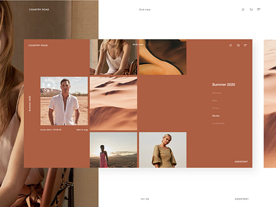
Here are a few designs testing my solution with a right hand navigation, with concept UI of the chosen brand.
I choose to do two product pages targeted at two users types. One a browser who wants the imagery big and beautiful the other for quick browsing. An interaction is that the page adopts the main colour of the imagery being displayed.
* Rights to certain imagery sits with the brand Country Road.
