Scooter Rental App Design
The team is available for new projects! Drop us a line: hello@purrweb.com | WhatsApp | Website
Yo, friends! This is our attempt to design an app for renting scooters, check it out! 😎
What is your opinion on this minimalistic design and color palette?
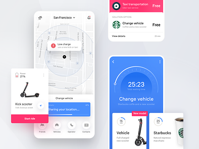
🛵 It works in the following way: the user installs the app and adds a payment method he/she likes (to simplify it, we integrated into the app a QR scanner). Once it’s done, the user keys in destination and departure points and sees the maximum rental amount on the screen. The amount will be put on hold for journey time and then debited from your account.
📍The shot on the left demonstrates an onboarding screen: this is what the user sees when launching the app for the first time. The central shot is a screen the user sees when renting a scooter: here users can choose a fare, check starting time and point, and edit the route or payment service. At the right — it’s a screen where the user selects the payment method.
🗺 The map works smoothly. When the user is on the ride, they will get soothing and pleasing notifications that help them navigate.
👨🏻🎨 The primary color is violet — bright and joyful. Matches the summer mood and fits in the youth. Riding scooters with friends is great (a person must be careful and keep a distance though).
Created by Julia Tikhiy-Tishchenko
Feedback helps us improve and grow, We’re keen to hear your thoughts! ❤️
PS We know to utilize UI/UX design to make users fall in love with a product. Check out how we used our skills to: - raise $400k as capital for startup - streamline cryptocurrency e-wallet - reboot a Real Estate startup - help newbies jump into investing - conquer the chef freelance market - simplify the life of event organizers And that's not all — you can find more case studies in our Blog! 💜


