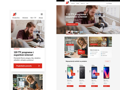
A1.hr Design
We worked in sprints and held a ton of workshops and meetings. So many A1 departments involved, so many opinions on the table at all times. Finally, simplicity won, as it rightfully should. Simpler interface equals better experience equals humans using the page more. We got rid of all decorative elements, out went everything that had no purpose and does not help the user. Bang bang we shot it down.
Tone of voice got the same treatment, corporate word puzzles got banned and easy to understand human words that explain A1 offers were left to reign.
More by Human View profile
Like
