YogiBirth - gift cards design
Gift cards design for the mobile application with online yoga studio for pregnant women.
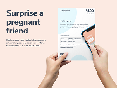
The main task - in the card, we had to provide login/pass for a new user. To make it straightforward, we decided to use UI text fields that are familiar to everybody. So, it will be super easy for the end-user what does it mean (credentials) and how to use it.
Additional task - to show that it's a mobile application with yoga lessons. To translate this, we added a mobile phone with an open application. But as the card is not big, and we have to show all other info additionally, we took only the corner of the app, but with the most essential info: Classes / Yoga.
Also, the big question was how to put the value that users get. Put "Free membership" in the top right corner, or the direct price of the membership. After researching the market of gift cards, we found out that the most popular way is to show the value in dollars. It's much easier for people to estimate the value of the gift.
Also, there is a QR-code on the card. To make people easily get to the special page on the website with all the additional info. Such a solution allows us to keep the card minimalistic and beautiful. For people who don't know how to use QRs, we duplicated the URL by words.
We have also made the full design of this application (iPhone, iPad, Android). It was fascinating! I will tell more about it in the future dribble shots. Stay tuned!
More about the project: https://www.yogibirth.com

