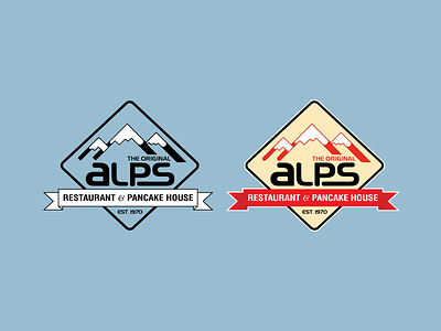
ALPS Logo Redesign
Haven't posted anything up in awhile so here goes.
Thought it would be fun to play around with a redesign for a local pancake house that has a fairly out of date logo. Great food and good hang out if you are ever in the Chicago area. Wanted to make it feel a little more like a black diamond marker you would see on the slopes.
Left some sharper edges on the black & white version since I wasn't sure which I liked better. The harsh sharp or the rounded since the logo text is round.
More by Bryan Horsey View profile
Like
