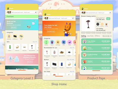
NookMobile Concept: Shop Screens
For the shop applet for NookMobile, I took a lot of inspiration from the popular Nookazon site while merging elements from eBay and Amazon. Banners are great ways to highlight trendy items, such as relevant seasonal item rotations or items that have had a high spike in interest within a given week.
For the categories, I decided to split up the items in a slightly different way from Nookazon and the Animal Crossing wikis, which mainly saw items such as wallpapers, rugs, and flooring separated into a "Decor" category rather than furniture.
The Product Page often follows the standard organizational structure of popular e-commerce mobile sites, and this structure lends itself well for future expansion, such as having a section for recommended items in between the product tags and the main list of sellers.
What do you think of these designs? Is there anything you'd change? Let me know in the comments!
