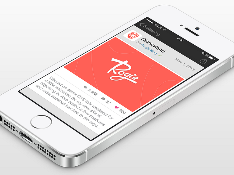
Dribbble for iOS 7 - Shot View
With the share icon you can easily share the picture in the shot.
I've always seen the comment while uploading a new shot as a description for the image you're uploading, so it doesn't make much sense to me to display it as a comment. I wouldn't normally change something but I felt this was a better solution for what it's used for. Now instead it actually looks like part of the image and displayed like a description instead of another comment.
It's greyed out and you have to click on it to reveal more, below will be comments, which is why you don't want the text to take up too much space.
Real pixels: http://cl.ly/RWKa
Edit: Seems the screenshot got blurry, resized in Pixelmator instead of Photoshop. Looks better when sharper.
More by Henrik View profile
Like
