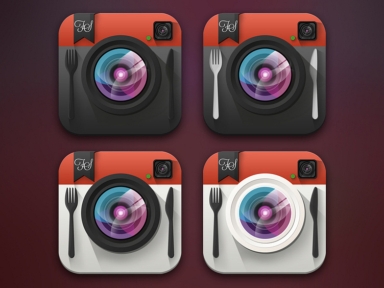
Flat FoodShootr Icon Concepts for iOS 7
Would love some feedback on this. We're almost done optimizing FoodShootr for iOS 7 and we went from a red header with dark UI to red header with light UI. Our original icon was much more representative of the top 2 icons. Which one do you prefer? Thanks!
More by Crown Creative View profile
Like
