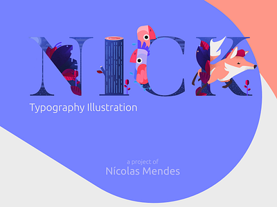
NICK - Typography Illustration
Here in Dribbble I'm limited to publish great posts, I really recommend that you see the Behance Full Post: https://www.behance.net/gallery/99669047/NICK-Typography-Illustration
The idea was generated when I realized the need to create a Banner for Behance, with
that I started to love to draw on the illustrations of the UnDraw Project and decided to use
my childhood nickname: NICK! The typographic and illustrated impact on the project in general, shows a composition of colors and nighttime ambient lighting, a complex
application of layer masks with a well-dosed mixture between vectors and pixels, the whole project was carried out at Affinity Designer.
The
use of abstraction in elements of nature and animals was a widely used resource.
My dedication in this work was not just for a simple banner, but for learning and adding to my skills, always learning more and more!
Please comment and leave a like for me to know if you liked it, observed any inconsistencies, failure of contrasts or composition :)
Here in Dribbble I'm limited to publish great posts, I really recommend that you see the Behance Full Post: https://www.behance.net/gallery/99669047/NICK-Typography-Illustration
