Unboxed Exploration - Logo Lock-up's by The Logo Smith

New Logo & Brand Identity Design for Unboxed Investor Relations, in the USA.
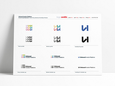
Current direction is using the U as a building block for the logomark; creating a strong, reassuring, meaningful & positive 'financial' mark.
The far right vertical 'could' be the 'I', and I did indeed look at options to rotate the left vertical, to also become the 'r', but that was being too greedy, and lost the square proportions that makes this work.
Being modular, we can remove/add instances of the 'U/I' to create alternate logo versions, from 9-6 down to just the 1, depending on use, location & application of the logo.
Number of brand name arrangements are possible with the typography, adding to the logos flexility.