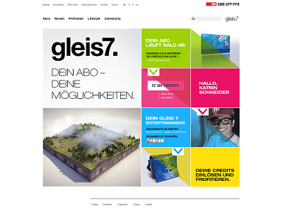
Gleis7 Cockpit - Screendesign Pitch
For Gleis7 I had the chance to create a screendesign for the new cockpit on their homepage. So instead of accomplishing a complete redesign of the page, the client wanted to get a new startscreen with all relevant content in order to grant a better usability. Thus I created two colorful designs which address especially young people and provide an overview of the four different content areas. The design itself has a clear appearance with a strong focus on typography, colors and above all the diagonal which has a special mouseover-effect and gives the whole look a certain dynamic. All in all, the new cockpit has a better navigation and is dynamic with mouseover-effects and diverse slideshows.
Concept made by Maxomedia AG and myself, screendesign made by me.
