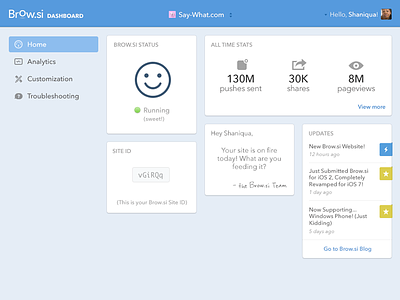
Dashboard Homepage
Getting on with the redesign of Brow.si website, this time it's the dashboard.
We've decided to add a homepage to the dashboard (the current homepage is just one of the dashboard's pages) to make it easy for our users to see at a glance what's going on with their Brow.si, and delight them on the way.
The cards design seems to fit well for showing tidbits of data. Really hoping for the possibly too-many cards not to look overwhelming :)
Check the attached images for the full shot and the dropdown menu for toggling between websites.
Textual feedback is cool. Thanks!
More by Oz Pinhas View profile
Like


