Making progress
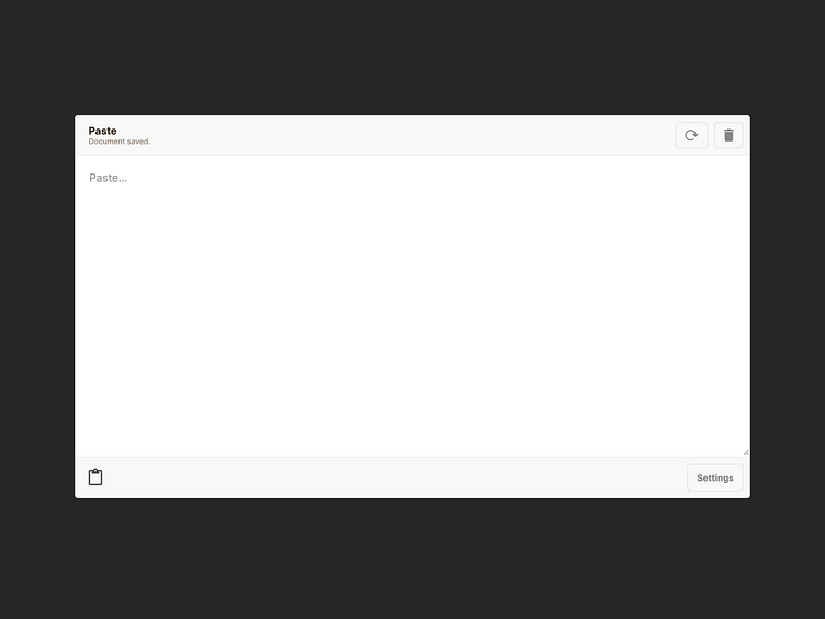
I've added some basic UI elements on the screen.
The app name and status are shown in the upper right corner. Available actions are on the right. The app icon is bottom left, and settings/profile is located in the bottom right app screen corner.
Everything else is reserved for the app's main feature...
Also, testing out the dark background so that UI stands out clearly.
More by Tom Green View profile
Like

