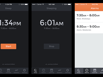
Sleep Cycle
Hey there Dribbble folks, I haven't posted a single thing in almost three months. Been busy with client work, several new Tumblr themes are cooking and Draft.im is getting a much needed redesign (more on that soon).
This shot consists of some piece I did a while ago to get the hang of designing with the new guidelines for iOS7. It's a redesign of a pretty nice app called Sleep Cycle (try it!). I've really started to appreciate the new design guidelines more and more. But some things just don't work in my opinion (ie. frameless text buttons and android-like toolbars). Though, I really like how apps are more brand-able by using colors instead of layer-styles. It's definitely way better for consistency across the OS. Anyway, feedback is always appreciated!
Have a nice day. :)

