Teesalonika Logo Design
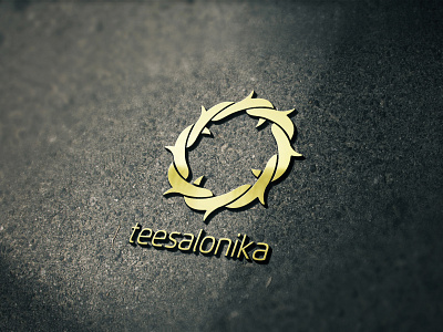
Nine years ago I designed this logo for a well known online religious community media in South East Asia. Obviously, the idea behind the iconic logomark was derived from 'Crown of Thorns'. The interlinked shapes in the radial composition represents unity, synergy, and sustainability,
This is one of my favorite logo designs in my portfolio. It looks strong and bold, as well as lovely at the same time, don't you think so?
