Brand Update
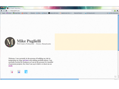
My brand update, finished sometime last year, finally got a chance to get online and the design update has trickled down to my other outlets on twitter and on my blog. This brand update is much more in line with my minimalist design style with a hopeful infusion of my professionalism and maturity. I strive for the identity to feel refined, classic, and sleek (not trying to sound pompous here).
Looking to integrate my blog, portfolio pieces, and some fun jquery goodies to help refine the functionality of the site.
Also going to be updating the page later today to resolve the unnecessary scrolling.
Love to have everyone's thoughts. Thanks!
P.S. That is Chuck Anderson's Google Chrome theme.
More by Mike Puglielli View profile
Like
