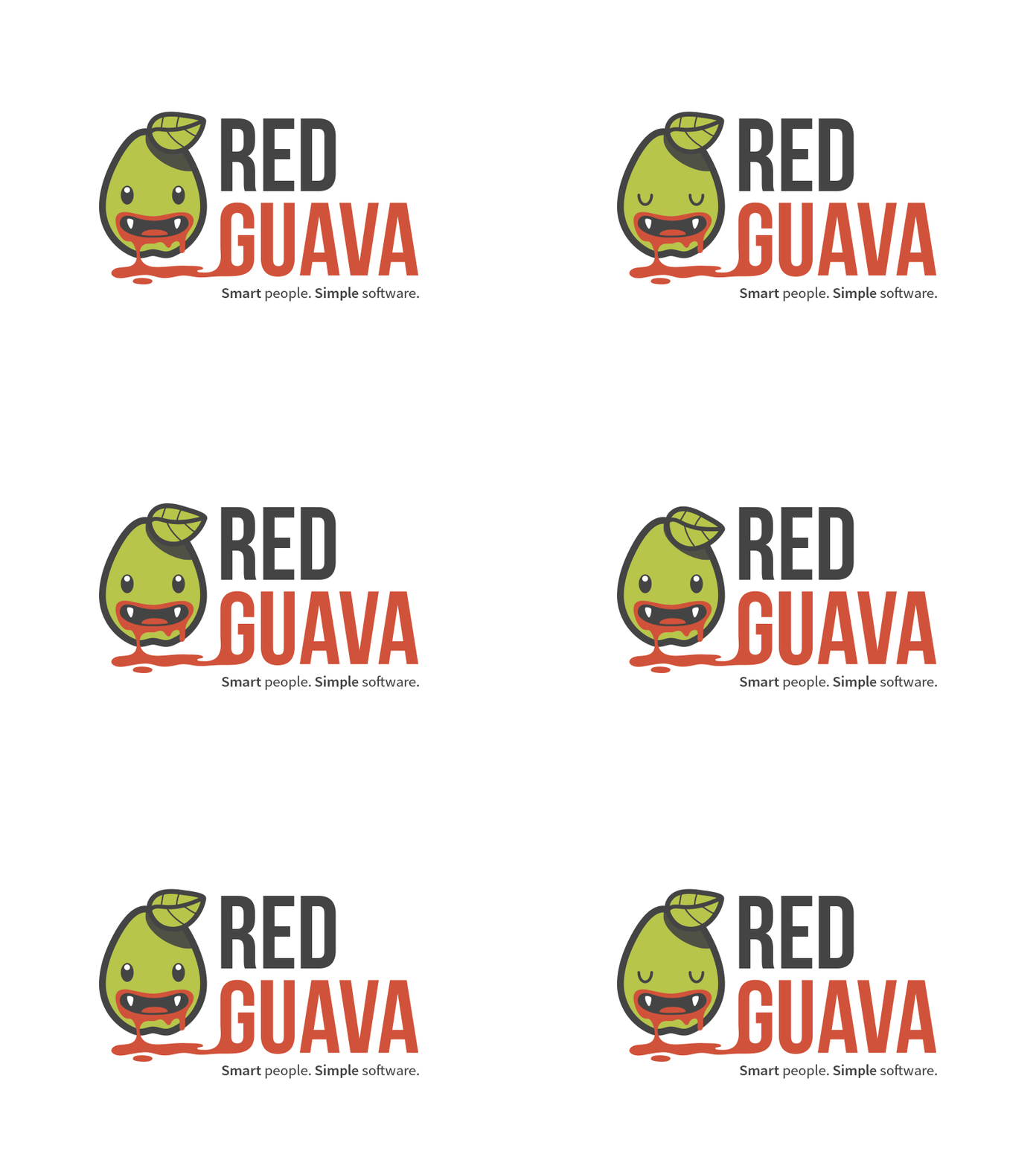
Guampire
I recently finished redesigning the website for our flagship product, Cliniko (www.cliniko.com); now I'm turning my hand to our company logo.
I am often pulled in two ways when I start a design, and in this case particularly so. On the one hand, I want to create something 'grown up', something Swiss or Bauhaus inspired, clean, geometric and economical. On the other hand, if I'm going to be spending the foreseeable future working for one company with one product, I kind of want to have some fun. And I expect the feeling that feeling would be shared by my colleagues.
So this is where I'm coming from with this logo design for a starting point. I think this would be a fun character to work with. I can already imagine killing him in a myriad of ways... he could appear on our blog page, for example, with a pen lanced right through him with red juice spurting out. A character might also help to liven up otherwise bland stuff such as emails or invoices.
