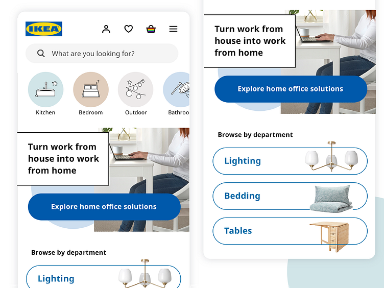
Ikea homepage mobile redesign
Today I decided to illustrate the concepts I learned in Google's Anna Potina's webinar on mobile UX best practices (linked below) by redesigning the Ikea mobile web homepage :)
The current page prioritizes some marketing efforts with a rotating banner, and then shares some image links that are not organized in any apparent way. It does not have a central call to action. My goal was to encourage users to browse the site more, and discover new products.
Here's what I learned and how it translated to this design:
1. Don't use rotating banners. I removed this.
2. In the copy, explain to users who they will be/how they will feel when they use your product, not what the features are. Rather than listing new products, I created a the 'work from home' headline to target users who are now using their home as an office, but don't feel completely comfortable there yet.
3. In the copy, keep in mind where your users are in their journey. Here, the CTA 'explore home office solutions' is friendlier than 'chose', 'buy', 'purchase' or even 'find' because it reflects where users likely are, in the exploratory phase.
4. Keep browsing categories from desktop in mobile. Rather than collapsing all the categories from desktop into the hamburger, I kept them at the top of the screen with some cute custom icons to encourage users to browse around. Allowing them to scroll horizontally saves vertical space but is still a known design pattern.
5. Include these three essential items above the fold: 1) value proposition, 2) call-to-action, 3) visuals. This is accomplished with the work from home section.
6. Break the fold so users know they can keep scrolling down. The 'browse by department' section begins above the fold and is cut off so users know it continues below.
Let me know what you think of these changes! Anything I missed?
https://www.uxpin.com/studio/webinars/test-learn-change-mobile-ux-best-practices-and-learnings-from-600-audits/
