DailyUI #016 - Pop-Up/Overlay
Hola Dribbblers 👋
This is my #016 #DailyUI design.
Design Hint 💻 - Design a Pop-Up/Overlay. Is it a web sign-up form that pops up? Is it an ad overlay?
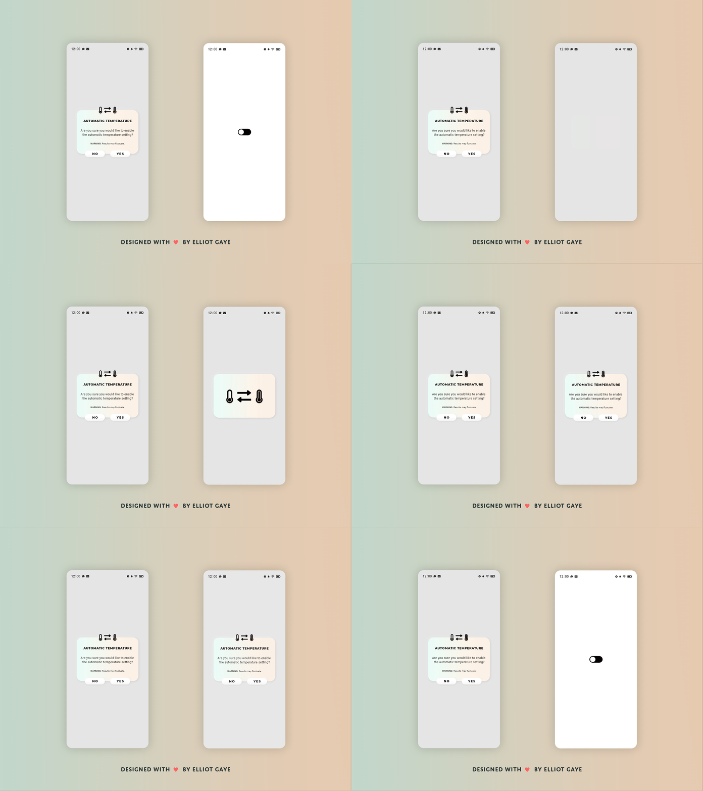
The Idea 💡 - The idea for today’s UI design is a pop-up/overlay for a theoretical smart thermometer app for Android and iOS. The design will feature some kind of colour gradient (colours not yet determined) and neumorphic elements throughout, to create a more modern feeling UI. The layout will be mostly dominated by text (for obvious reasons), it is a text overlay after all - but will also feature some minor iconography.
Final Thoughts 🧠 - It looks pretty cool! I mean it's a simple pop-up that would overlay other elements, but it's the way I've designed and animated it. I first designed the actual pop-up and then I animated it afterwards, I spent some time coming up with variations of animations. The one that is being shown (right) was the best in terms of aesthetics, feeling and speed - it was balanced, unlike the others, and it also did a better job at catching the user's attention. I ended up going with a soft Turquoise and soft Orange for the gradient's colour. The Turquoise for the cold temp and Orange for the hot temp, and placed it horizontally to match up with the top heavy iconography. The way I have laid out the icons, information and buttons all feel like they're in the right spot, along with the neumorphic elements make for a great looking UI in my opinion. Overall, I am really pleased with what I managed to create for such a simple piece of UI, and I think I've put in an adequate amount of thought into the process of designing what you see before you.
Hope you like, press "L" if you ❤️ my work!
As always, I welcome any feedback! 😄
Lastly, share the love by pressing the share button if you really like what you see! 👍
- Elliot
