TrackTik Mark Evolution
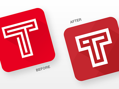
The revised mark and app icon logo solves for thin strokes and illogical shadows.
It also introduces improvements by dropping the labyrinth motif in favor of a simpler mark where TrackTik's double Ts become visible, by introducing more depth, and tweaking its colour for more maturity and reliability.