Gmail Redesign
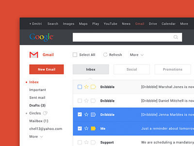
Here's a Gmail homepage redesign, that's a bit cleaner then what it currently is. At the moment the way they have it is just a bit crowded (even in "comfortable" mode) and not as fluent as it could be.
Check out attached for bigger view with all the details. Blue is checked off, grey is highlight and unread are the white background with bold type.
I had lots of fun doing this design!
Follow me on Twitter machine and Instagram
More by Dmitri Litvinov View profile
Like

