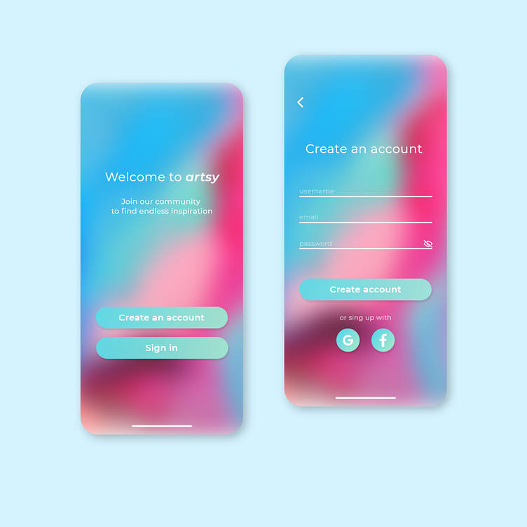
Sign up screen
Hi! So today I joined the 100 daily ui challenge! The first one was a sign up page. It took me a long time to design since I had never made one of these before and I wasn't sure if it was better to add an image in the background or an icon. But in the end it turned out pretty good!
What I learned: - Sign up screens have usually little content, it's important to space it correctly so it doesn't look empty. - The chosen font used in the buttons was not the right choice since after I posted it I realized it looks a bit squished. I decided not to delete it since I think it's important to document everything, even when some things are not perfect, so I can learn from them :)
Thank you!
More by Nechi Maffei View profile
Like
