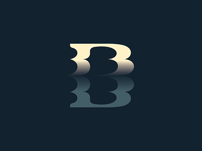
BB(D) Breno Blurred Dawn // Sisters 03/15 - Logolounge 2020
As I said in the last two shot (please, check it!), this side-project is meant to be an exercise on the logo trends of the year.
(since I haven't any logo selected for this years publication haha) ⠀
⠀
The idea here can be a bit ambiguous, as I'm always rethinking my own identity (maybe some of you can relate) I'm using also this study project for try new ways to convey the BB idea, Breno Bitencourt recently sounds to me somewhat too much egolatry and I'm thinking new phrases with BB to migrate my personal branding to (actually I'm improvising here, have no idea what to do) so, do you see the Big B both stacked small B's are forming? Yes, blurred like acceleration, like Dreams, a mirage emerging on the horizon, whay you can sea in the mirror?... I also like how something I can see a D for Design in this double B mark.
⠀
Do you think this concept could be clear enought to be used on a real personal logo? ⠀
⠀
Plus, I've decided to work on a fictional logo concept for each of the sections created for the Logolounge 2020 Trend Report.
I'm excited to try this new stuff and hope you guys enjoy this quick journey with me as well! ⠀
⠀
The description of the trend I'm following on this shot is above, I'd love to keep the discussion on this topic flow so here goes the text: ⠀
⠀
"Humans have a desire to achieve a level of balance and harmony. We like to create order. As a rule, order can give us a sense of wellbeing. This is all part of a much bigger psychological conversation associated with the Gestalt theory, but for the purpose of this trend it’s driven by our comfort with symmetry. This group of logos are most often crafted from two identical elements either mirrored or rotationally nestled together after a 180-degree rotation.
It’s not uncommon for the end product to assume the shape of a letterform or be constructed by reflective letters. The symmetry of these logos creates a sense of assurance in much the same way you find harmony in a yin yang symbol. It conveys the idea of a strong partnership that is well suited and beneficial to both sides. Rotational pairings can easily represent a sense of motion or action that may demonstrate a positive aspect of the client’s nature. Like the siblings this trend is named for, the two distinct elements may be in perfect harmony or reference co-joined elements rife with tension. Regardless they will work it out. After all, they are family." ⠀
⠀
(article excerpt by Bill Gardner) ⠀
⠀
Let me know what you think about this work, my friend :)
Feedback is really highly appreciated! ⠀

