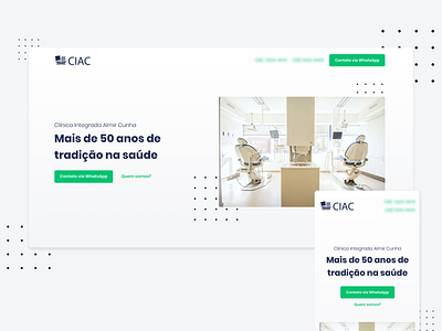
Dental and Medical Clinic • Landing Page
The client for this project wanted a clean and straightforward website that would only bring up the general and information regarding the clinic.
That being said, I decided to apply the blue color on the logo for the interface's texts and the fresh green for CTA buttons and highlights over the off-white background.
Check out my portfolio: https://www.leticiabahr.com/
More by Letícia Bahr View profile
Like
