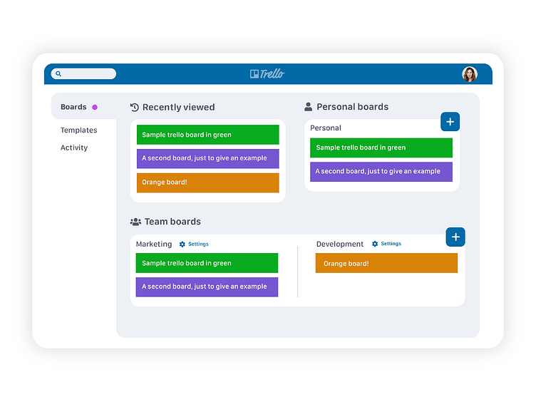
Trello Boards redesign
Today I decided to do a quick little redesign of the Trello boards page, one of my favorite products!
Some of my pain points with the page are that it requires a lot of scrolling to see all my boards, and it is hard to see how they are organized. My goals was to create more hierarchy and reduce the scrolling.
- Gave more structure to the page by grouping the boards into three sections- recent, personal, and teams.
- Reduced the amount of icons on the page to reduce clutter and draw attention to the three groups.
- Reduced the empty space taken up by the large colored tiles for each board by making them smaller and creating a smaller 'create new' button.
- Renamed home "activity" since it doesn't take the user to the same place the "home" icon on the top bar does.
- Took away the top bar navigation for the board view.
- Grouped all the team board settings buttons under one "settings" button to reduce clutter.
Let me know what you think of the redesign! What are you favorite parts of Trello?
