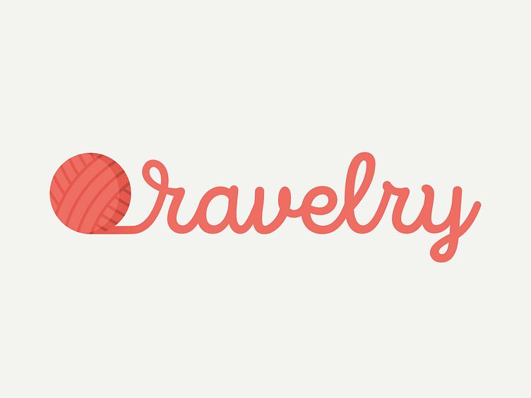
Ravelry Logo
I love all types of yarn crafts, and recently my favorite yarn craft website, Ravelry.com, updated their logo. The way I describe Ravelry to non-crafters is, "Ravelry is like Pinterest, Facebook, and Instagram combined to create a single platform for all yarn crafts: knitting, crochet, weaving, spinning, and yarn dyeing."
When I saw their new logo, I was unsure about it. It's strictly typographical, which can work for certain well-known brands, but in my opinion, it is not the best option for a brand most people outside of the crafting community don't know of.
Their original logo had this pink/red circle and black lines. It was recognizable as Ravelry's logo, but no one knew what it was supposed to be (hint: it was a ball of yarn). I didn't know what it was until I was reading about their new logo.
I designed this logo with the general public in mind. I want people to immediately know what Ravelry is about, yarn crafts. I used a monoline script to match the style of the yarn ball and give a modern vibe. The colors, which are Ravelry's new colors, are playful but not too feminine. Ravelry prides itself on being an "inclusive, friendly website," and I wanted to echo that statement.
