Twitter Redesign
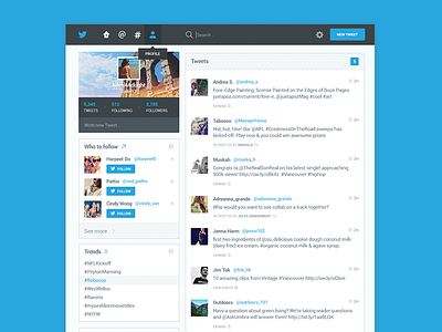
I've always loved Twitter design, but I always thought they could do a little bit better. It seems a bit crowded with too many lines and just bit of a mess without a focus on the main part which are the tweets.
So I had sometime to do a bit of a redesign, I made everything a bit flatter, simplified a few things and overall made it a bit cleaner.
Check out attached for bigger view and x2.
Follow me on Twitter machine and Instagram
More by Dmitri Litvinov View profile
Like


