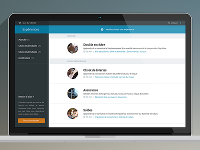
iPad student game
The first game of the the student app i am working on for my client.
Developers created a survey which was really hard to understand. Our user tests show that people didn't know at all what to do, and where to look. I tried to make it clearer, but it was hard because the client want to show a lot of information. I decided to use boxes instead, and the focus jump to each box to help the user to focus on one thing at once.
The left panel is there in order to help the user, and to give tips.
Press "L" to show some love, and follow me if you like my work.
As usual, comments are ultra welcome.
Have a nice day guys
More by Aurélien Salomon UX ➔ View profile
Like


