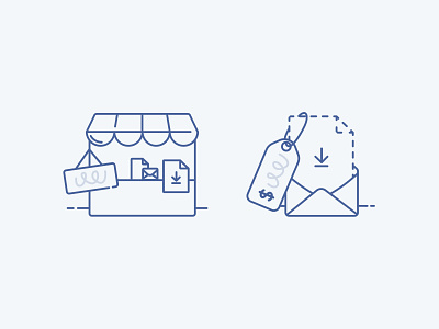
ConvertKit Commerce empty state illustrations
The product team needed some illustrations to use for when a creator hasn't added any products or set up payments yet inside ConvertKit Commerce (left) and for when payment is set up but no products have been added (right).
This is where I'm at with them so far! Trying to match a line-illustration style Bruno first introduced into our design system in the shot I've rebounded.
Wanted to use classic "store" metaphors like the price tag and stall. But show that it's for digital products (file downloads, paid newsletters, email courses etc).
(FYI: The first beta invites for ConvertKit Commerce start going out from July 15th! Get on the waitlist here )
More by ConvertKit View profile
Like

