Dashboard Menu Colour Variations
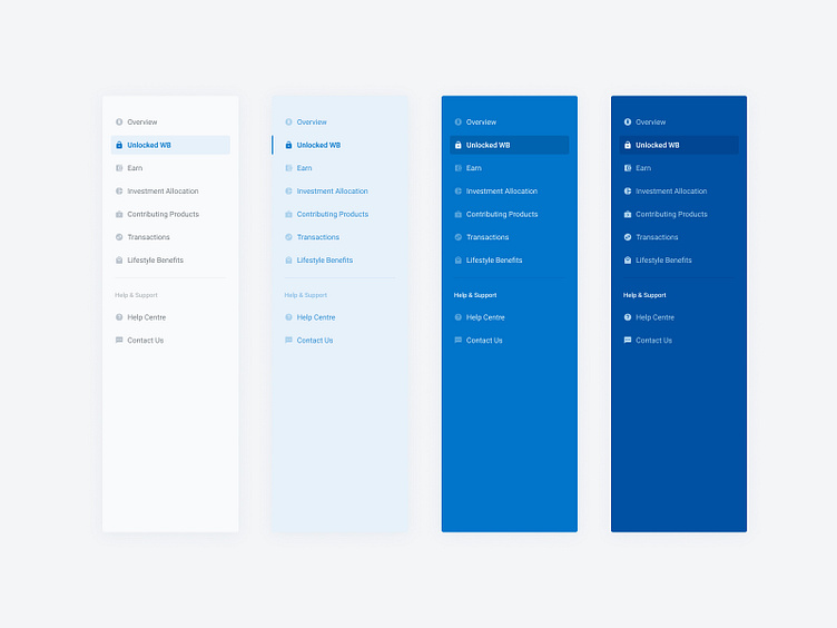


Some of the earlier explorations around colour options for the dashboard side menu bar. We really only started to get a sense for the colour when paired up with the actual UI on the page. And based on this actually ended up going with the lighter option. The dark variations felt a bit too prominent when placed in context, and detracted focus from the actual content on the page.
Some of the earlier explorations around colour options for the dashboard side menu bar. We really only started to get a sense for the colour when paired up with the actual UI on the page. And based on this actually ended up going with the lighter option. The dark variations felt a bit too prominent when placed in context, and detracted focus from the actual content on the page.