Dating Mobile App Design - Sign Up
Hi, This happens with me most of the time & I am sure it probably happened with you guys too, that whenever I open a new app after downloading it from the store. I am presented with a long and boring form to sign up & if that form is kinda long then I will give up instantly.
I dont know why people still uses it as with the passage of time the average span time of user's attention is getting less so why not show it in more presentable way.
So here is my take on that.
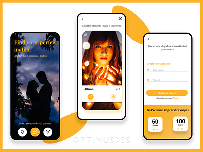
Screen 1: Instead of showing a boring form why not ask the questions in more interesting way. The first screen will ask the user about his/her gender any other essential requirement which is critical for that app.
Screen 2: Next we can ask for his/her personal details like Name, Age & display picture. And why not just show him/her the profile in real time. This will keep the user attentive and the user will provide the information with out any hesitation.
Screen 3: And Lastly ask for his username & password. Now that he/she had already provided most of his/her personal information so there is no point that he will back out now. They will happily provide the information.
On the sign up screen why not show a button which is more meaningful to the user or his/her purpose, the reason he/she has installed this app. That is why I have used "Find your match" button instead of conventional sign up button.
The reason I have shown the swipe package on 3rd screen is now the user had already seen the meaning of a swipe in real time in the previous screen so he/she will know that he/she is getting limited swipes in this app and these are 2 better options which he/she can opt in to enjoy the app
at its fullest.
These are really small tweaks but I am sure it will increase the number of sign ups or whataver target that company wants to achieve.
That is my point of view as a user & designer, if you guys disagree or have a better approach for this then feel free to share it in the comments.
