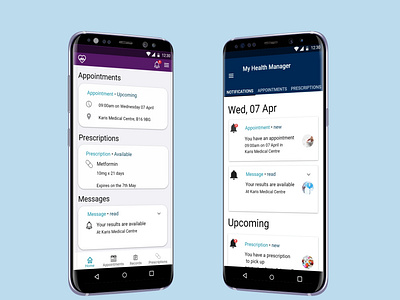
Primary Healthcare Management App home screens
A primary healthcare management app- Two alternative homescreens
This was developed as a UX challenge for a Msc UX design. I asked a number of users what they needed from a healthcare app- That was booking appointments, ordering prescriptions and viewing records. They wanted a stripped down version of a healthcare management app to just access what they needed.
From the survey I deduced that the app needed to convey:
Trust
Competence
Security
Calm
The colour schemes were chosen to evoke trust and confidence.
More by Maeve Breslin View profile
Like
