O Rocchi
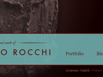
First stab at redesigning a site for an Italian sculptor. I'm pleased with the typography of the header, but am unsure about the color palette. I think I'll try a lighter version, too.
More by Michael Bester View profile
Like
