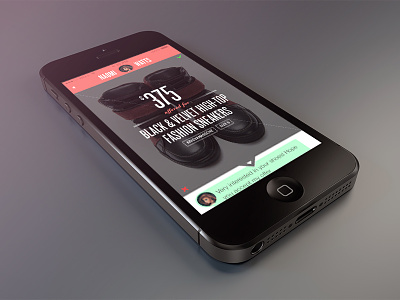
Vice Versa - diagonal binary UI
My debut shot! so nervous but glad to be here :D
This is an exploration on binary UI optimized for a single hand use on mobile devices that reflects the natural movement of the thumb.
Most of binary UIs used in Tinder, Polar etc. have two buttons laid out horizontally side by side. I believe this goes against the natural movement of the thumb, especially when the user is holding the device with one hand; thumb pivots from the first joint attached to the hand in a semi-circular motion. Such UI results in user stretching out to reach the button on the further side.
By bisecting the screen diagonally, such effort is not needed as two buttons are almost equidistant from the thumb.
Harsh but constructive feedbacks are always welcomed. Thanks!
More by Michael Oh View profile
Like

